Homerun Miko
Homerun Miko is an isometric action puzzle game about Japanese spirits and baseball. It was created as part of my senior capstone project at UCSC and involved a team of 10 people and a 9 month development cycle.
My role on this project was as lead designer. I designed and iterated on the gameplay interactions and puzzle designs, and worked alongside the programming team to implement those visions. I also composed all the music for the game.
Homerun Miko on Steam
https://youtu.be/pxyQMxoKhJY
Design
Homerun Miko is a puzzle game, and while what makes a good puzzle game can be hard to define, it boils down to a few main components.
-
The game should teach you as you play. Figuring out mechanics is a large part of the progression the player goes through.
-
The game should explore as much of the possibility space as it can. If the players can easily come up with interactions that you never considered, then you left a lot of possibilities on the table.
-
The game should be interesting to explore. The mechanics should be simple but hint at a hidden depth that begs the player to dive in deeper.
In contrast to other genres, the player experience can often take a backseat to the mechanics that the player is exploring. It’s pretty hard to manufacture the feeling of discovery without actually providing mechanics that are worth discovering. To that end, I focused on constraining my move set to something simple and teasing out the most I could by using combination and reorganization.
The primary actions given to the player are a Hit, a Grab, plus the movement of the player and a secondary spirit character. This, in combination with the obstacles detailed below, made 20+ puzzles that all said something interesting about the puzzle space of the game.
The obstacles were based on one of the most basic mechanics in games: collision. This mechanic is often under explored in non-puzzle games, but many puzzle games have pushed it to it’s limit. While I don’t think Homerun Miko is on par with some of the greats, it does explore collision in a somewhat unique way.

The first and most basic collisions is no collision at all. The floor tiles allow the player, the spirit, and the bunny enemies to traverse with no issues.
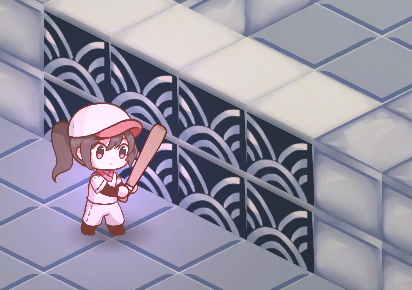
Next is that wall tiles, which are the polar opposite of the floor. They block movement from the player, the spirit, and enemies. However, thrown enemies will bounce off of walls, creating some interesting navigation puzzles.
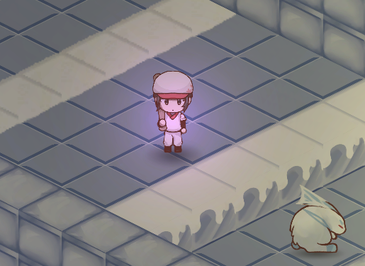
To round out the objects in the first area, we have on/off walls that toggle between raised and lowered every time you hit an enemy into an altar. This forms the basic gameplay loop of knocking enemies into altars, and then exiting the level through the now open door.
These three elements can go a long way, and I was able to make a good portion of the puzzles with just these, but there are a lot more possibilities to explore.
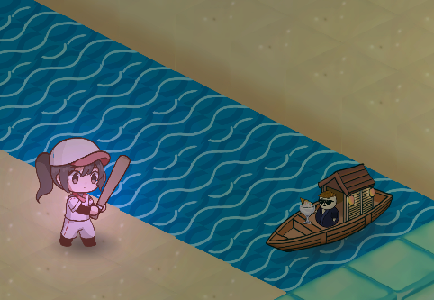
In the second area, you are confronted with water, which allows the spirit to pass through but not the player. Thrown enemies can also pass over, but falling in resets their position.
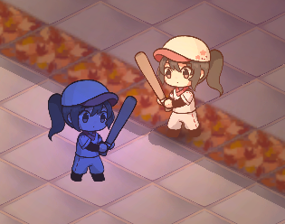
In the third area, you find a strange mist that allows the player to walk, but not the spirit. Enemies are unaffected by the mist.
In the last area, all these mechanics are blended together, allowing the player to take the simplified lessons learned in the other areas into a few final tests of their abilities.
In my playtesting, I noticed a type of collision appear that I had not intended but had yet to be explored elsewhere. This was in the form of the altars, which grabbed any enemies that were thrown into them - but only once. In the secret side levels in each area, I combined this mechanic with the mechanics of that level to teach the player about how it worked. This culminates in the last side area puzzle, which takes this to an extreme, combining all the mechanics together for one final challenge.
There are probably other combinations of collisions to explore, especially if more and more elements are added on top, but I think this game was a good exploration of the mechanics I found most easily communicated to the player.
I am especially proud of the lack of an explicit tutorial. The characters in the game explain some basic movement mechanics, but other than that, the actions of the player are mostly suggested through good level design and affordances that the player might already have about how water or the basics of baseball. I surprised myself with how much I got out of the base mechanics, and I’m happy with the level of interest that the puzzle game could offer its players.
Linear algebra to the rescue
At one point during the game’s development, we ran into an issue bouncing enemies off the walls. What we didn’t realize at first was that the isometric perspective impacts these results quite a bit, and it took a fair bit of intuition and critical thinking to get past it.
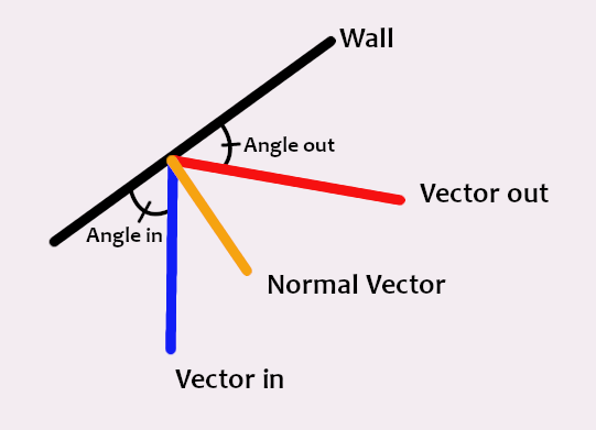
To start off, let me explain the basics of calculating a reflection on a wall from a top down perspective. If you throw an enemy at a wall, it’s velocity vector simply needs to be flipped over the normal, which is the line perpindicular to the object surface. In 2D, this means the line perpindicular to the wall line.
If you look at what happens when you try this technique for an isometric level, you can start to see where the problems come into play.
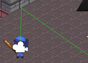
The normal that the wall creates looks a bit wonky, but if you hold your hand up to the monitor you can see that it is technically correct as far as the computer is concerned, but it’s not quite where our eye tells us it should be. In this case, our brain is filling in the gaps and pretending it’s a 3D space, something we’d like the computer to be able to do as well.
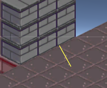
The first thing we tried was to offset the angle by a small amount, so the normal would align where it should, but this doesn’t quite work. Not only does it make it possible to get angles that go past the wall, but it also skews all the shots by a fair bit.
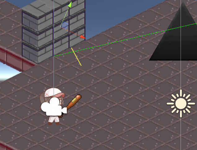
We also tried to hard code a certain number of input angles and output angles, but it ended up being too specific, since it would need to be done for all walls.
At this point, my team thought it might be time to give up, but I wasn’t quite ready to throw in the towel. As someone who watches math and science videos for fun, I was reminded of a really helpful 3D animation I had seen that helped me understand linear algebra. Sure enough, his presentation helped me build my own intuition for how to apply the math to our project.
https://youtu.be/kYB8IZa5AuE?t=76
The basics of how it applies are as follows: The camera plane at any given time is our x-y coordinate system. When the camera is tilted so that the perspective is isometric the y axis becomes compressed, skewing the results of any physics you might try to compute. By applying a matrix transformation before and after the calculation you can do all the math in the “real world” and come back to the isometric world when you’re done.
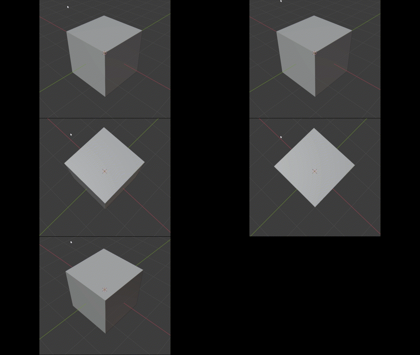
After consulting with a fellow math nerd we came up with this solution: Basically you start with the normal of the wall and the vector you wish to reflect off the wall. Since this vector is coming from an isometric perspective, you need to translate it into the top down perspective. You achieve this using matrix transformations, simulating the effect of panning the camera plane to face straight down. After transforming the input and normal vectors, you can calculate the resulting vector by flipping the transformed vector over the transformed normal. Finally, you transform the resulting vector back into the isometric plane using an inverse of the matrix transformations used before.
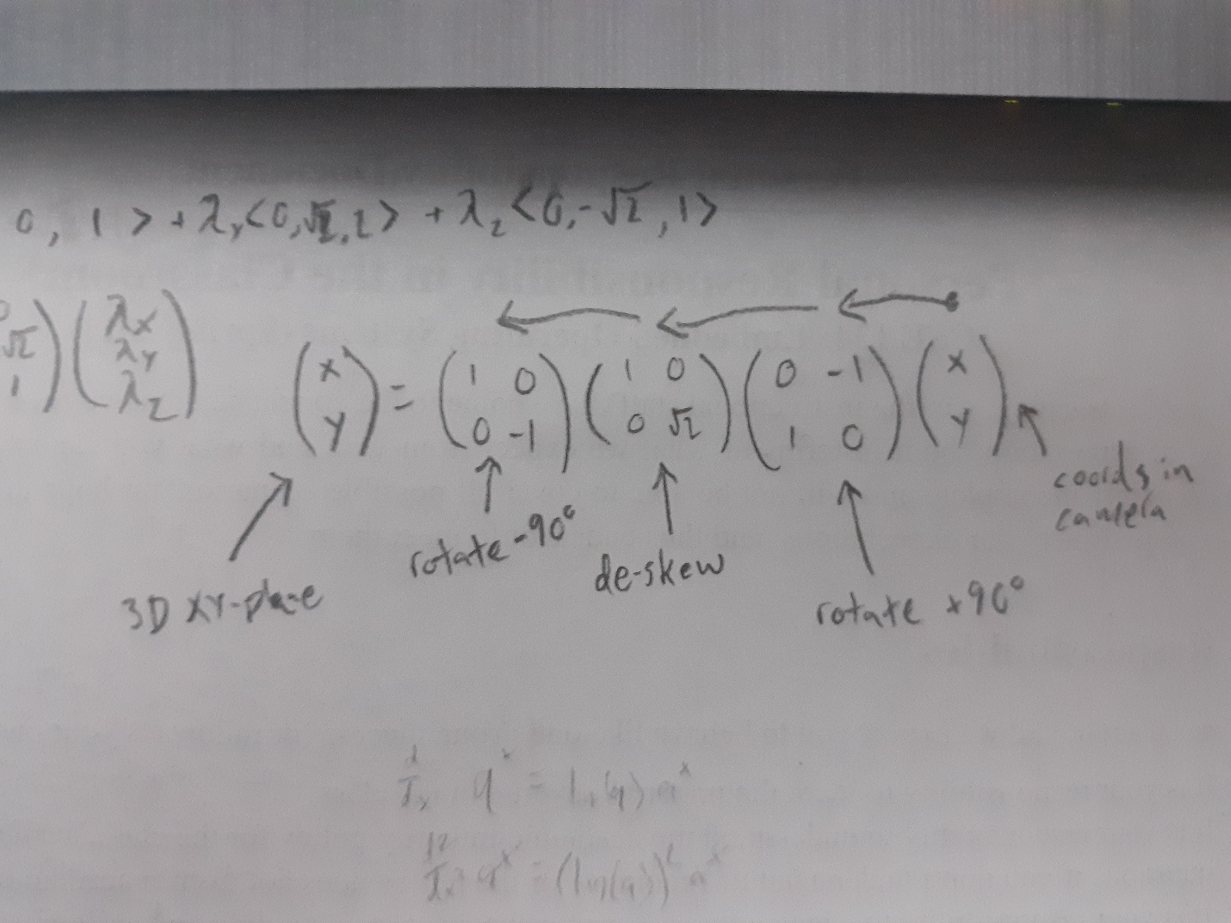
There’s a bit more to it since the normal had to be flipped by 90 degrees before and after transforming, but once we had the intuition of what to do, the rest came a lot easier.
Designing in meat space
I tried a lot of technologies to design the levels in this game, but the one that I settled on was to use a board from the game Go and salvaged game pieces from several other games to recreate the levels in 3D.
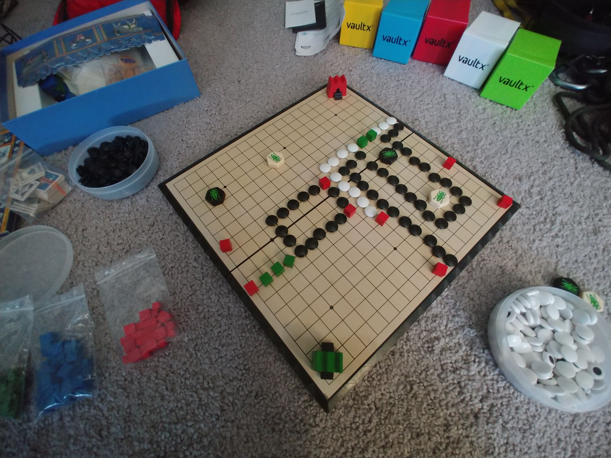
There’s a couple reasons I chose this approach, the first of which being that it’s very malleable. If I designed on paper, which I tried for a bit, then my designs would have to be erased and rewritten each time I wanted to move a shrine a little to the left. Maybe I’m just used to working digitally, but being able to move stuff around or undo what I just did immediately is a big plus for me.
The second reason is for perspective. When puzzles are on a grid, it would be easy to design them from a straight perspective, but I wanted to see what each level would look like before I sent it off. On the other hand, putting it at a slant really messes with how my brain thinks of putting the pieces together. Ultimately, I settled on an approach that let me do both, designing on an orthogonal grid and then standing up and tilting the board to see what it would look like in game.